Everyone had a funny reaction to the new Tesla Cybertruck. For something that hadn’t leaked at all, no one knew how it’d look like, and no one expected it to look like it does. I wonder how I would have reacted if I was there in person, given that I laughed while watching the live-stream. I thought Elon Musk was trolling everyone. This has to be a lie.
When you think of it, in some ways he was. He knew the design. And he knew the public didn’t expect it. I wonder if over months he couldn’t wait to see how people would react to it’s first unveiling. I wonder if through the day while waiting for the event he was nervous and excited about how people would react.
Most of the videos from YouTubers after the event went viral. Everyone wanted to know more about the Truck. I personally wanted to see the interior; if it moved, if it was actually real. What were its specs? How much would it cost? What about the usual truck bed? Did it have one? If so, how big?
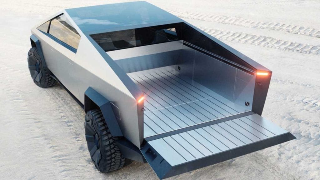
A few hours post-announcement, it was a trending topic everywhere. Google Search was full of people asking if the truck was real. Everyone was talking. The experts were already comparing it to competition. Arguments about its design. Memes. And all these led to over 250k pre-orders. Yes, a pre-order is only $100, and it’s refundable. But that translates to over $25 Million in interest free money.
I wonder what the reaction would have been had Tesla stuck with a normal boring design. What would be the conversation now? Would people be as ‘excited’ about the product as they are about this? Or would there be a lot of criticism? Would they have raised over 250 Million? Someone said somewhere through all the hype that it is better to be exciting than to be boring, and I believe that’s what’s worked magic in favour of the company.
In 2019, when every other truck sort of looks the same, standing out is important. And the design we currently think to be weird is what makes it different. It’s what will make people choose it over other trucks. You will definitely know that is a Tesla Cybertruck when you see it. No matter the color, styling, or location. And I doubt there’s any other company that’ll be bold enough to copy this design in a long while.
When Apple introduced the iPhone X a couple of years ago, it was weird. It was according to many ugly. And people said lots of bad things about it. Samsung went all in on adverts making fun, throwing shade. They have now deleted these ads.
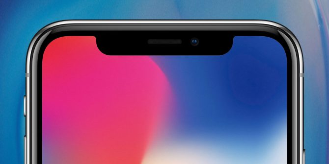
That notch was outright different. And big. Weird. But Apple really pushed the FaceID features in a bid to justify it. They even went ahead and dropped TouchID. And it all paid off: the weird look became the standard design for almost every phone maker throughout that year. Almost every company copied Apple. It was crazy. From TECNO to Motorola, everyone had a similar design. The Verge had an article on this after MWC.
Apple has gone on to keep this design through the iPhone Xs, and now the iPhone 11. It has become a look that you instantly associate with them even though widely copied. And even if in future people make fun, like they did immediately after announcement, what many will agree on is that it worked. It worked, and then it became boring, but it was unique, and it sold them phones.
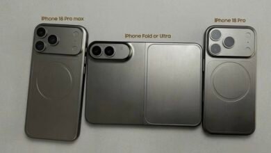
With dual and triple camera lenses on phones, we’ve seen many companies try different layouts, shapes and designs. Very few of these designs have stood out; Huawei’s boxy shape at the centre, OnePlus’ circle on the 7T, and Samsung’s horizontal layout on the S10 series. However, none of these has really been clearly associated with either company/brand – because each of them doesn’t really scream different, or unique. Well, apart from Apple’s iPhone 11.
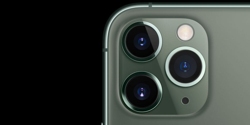
The lenses are big. And weird. If you can remember your first reaction to this design, and how you feel right now about it, you get my point. For me when the device leaked, I thought it was a joke. I told myself Apple would never go with that design. But here we are months later, post launch, and whenever you see that camera design, you instantly know it’s the iPhone 11 Pros. It no longer feels weird. It’s actually prestige for everyone who has one, so much to an extent there’s people with iPhones buying fake stickers to make their X and Xs look like 11 Pros.
That crazy, uneven arrangement of the cameras is now normal. And it properly distinguishes the new phones, and screams to everyone that this is the latest iPhone.
I believe many companies are realizing this and we will be seeing very weird designs in the coming years. Some will totally backfire, but any well thought-out designs will work. If you’ve already seen renders of the upcoming Samsung Galaxy S11 and are wondering just how crazy it’ll look, know that sometimes these leaks (including leaks from Google, Apple, etc) are meant to not only get the conversation rolling, and the hype high, but also to make people get used to the weird looks.


