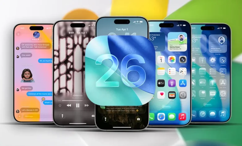

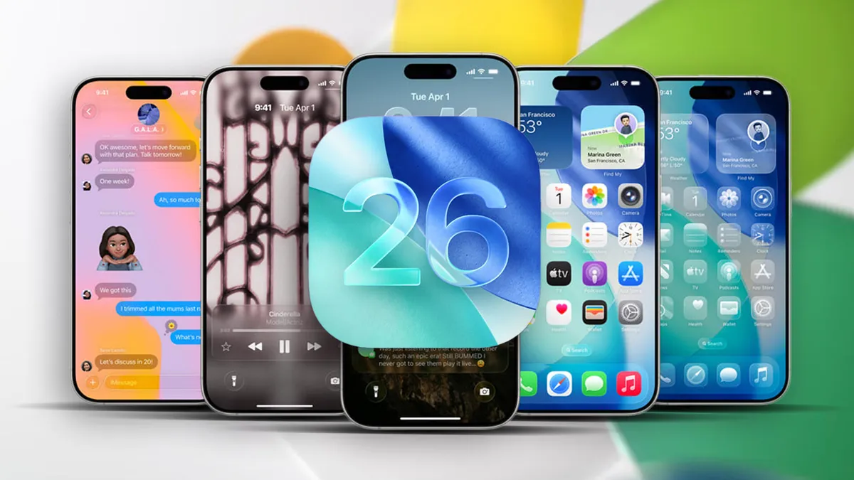
Apple’s iOS 26 update brings a bold new design language called Liquid Glass, giving the iPhone a glossy, translucent look. But instead of wowing users, the update has sparked frustration — with some reporting dizziness, vertigo, and eye strain after installing it.
What is Liquid Glass?
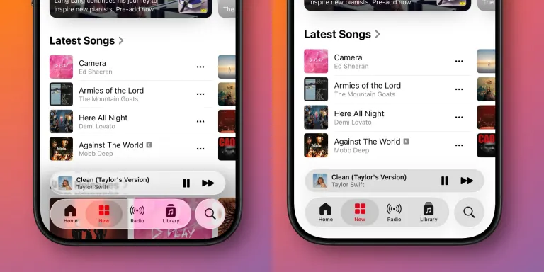
Liquid Glass uses blurred transparency to let background elements bleed through menus and buttons. Apple says this adds depth and makes it easier to understand how screens relate to one another. Critics argue it clutters the display with distracting visual noise and irrelevant background details.
While Apple toned things down slightly during the iOS 26 beta — particularly in Control Center — the design philosophy remains central to the new update.
User feedback
On Reddit, early adopters have described Liquid Glass as “an optical nightmare” and even compared it to being “drunk” while scrolling. The complaints mostly stem from how icons and overlays appear slightly tilted against dark wallpapers or alternative icon themes, creating visual effects that some find disorienting.
This isn’t the first time Apple’s design flourishes have caused problems. Back when parallax wallpapers debuted, users raised similar concerns about vertigo. But with Liquid Glass woven across the entire interface, the issue is harder to avoid. For users struggling with the look, however, there’s a way to reduce its impact.
How to turn it off
You can’t remove Liquid Glass entirely, but a built-in accessibility setting goes a long way:
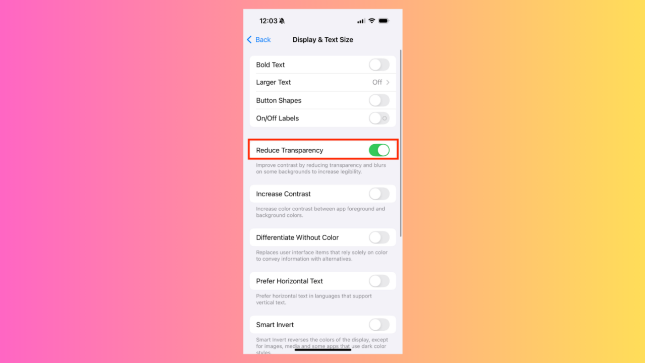
- Open Settings
- Go to Accessibility
- Tap Display & Text Size
- Switch on Reduce Transparency
This feature replaces translucent panels with solid backgrounds, making text easier to read and reducing the shimmer effect. It won’t revert every design tweak — wider toggle buttons, for example, remain — but it restores a cleaner, less busy look.
Extra tweaks for comfort
While you’re in Accessibility settings, enabling Increase Contrast can make buttons and menus stand out more clearly. Together, these options minimize the visual side effects of Liquid Glass while keeping the rest of iOS 26 intact.
A divisive update
Not everyone dislikes Apple’s design refresh. Some praise it for finally giving iOS a fresh look after years of subtle tweaks. But for users experiencing discomfort, Apple’s accessibility tools provide a welcome escape hatch.
With iOS 26, Apple has bet big on a more dynamic, layered aesthetic. For some, it’s a stylish leap forward. For others, it’s a literal headache — one that can thankfully be fixed in just a few taps.