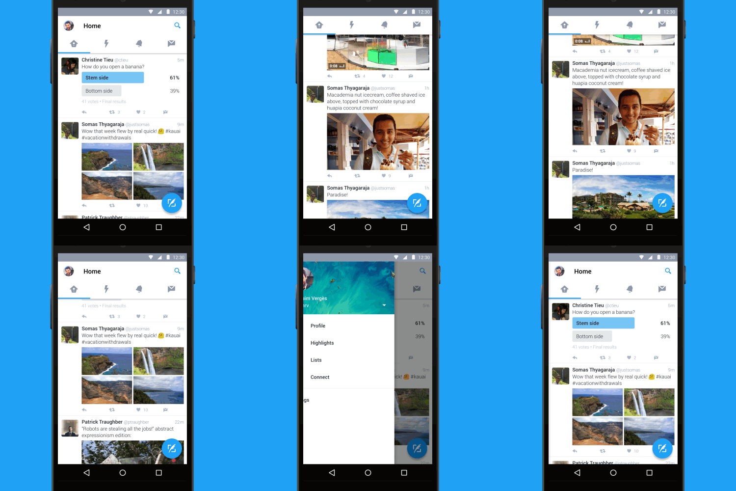
Twitter has today announced a new look Android App complete with Material design.

This is not Twitter’s first re-design on Android. And is something that I have personally long waited for as I didn’t like the overhaul a few years ago. I remember opening the app and feeling lost.
Some few months ago there was also a mini-redesign that changed the “major” colour/theme of the app from blue to white.
The new design changes are:
- A new top tab bar with swipe functionality to access Timeline, Notifications etc. People will get lost, I bet.
- Navigation menu, like in most Android Apps nowadays, that slides out from the side for access to your profile, Highlights, lists, the Connect tab, and settings. Now people will definitely get lost.
- And the floating button to send a tweet. We had seen it sometime back.
The new update is global and all you need to do is update your Android app to check out the change.
Twitter Blog > Twitter for Android gets a refresh


