Yesterday, a tweet from Apple Support reminded me of something I really hate when I use my iPhone: The Calculator App. Such a simple app where you only require a simple interface, yet so terrible to use, so hard to understand, so ugly, I always go to my browser to use Google’s web-based one.
Here’s the tweet:

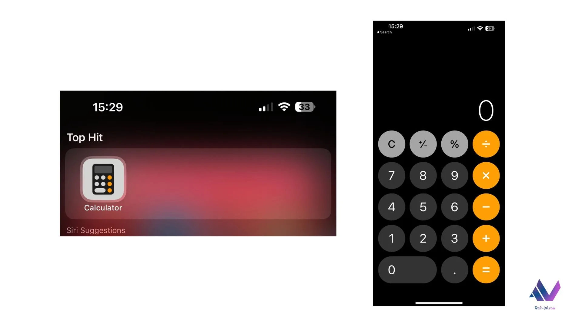
You can swipe left or right in Calculator to delete the last digit you typed. Like this.

On the tweet, Apple is explaining something – which based on the responses – very few people knew was possible. And even then, it is a whole hard manoeuvre that would be solved with just a simple addition of a delete key on the app.
A calculator app is one of the first major projects people learning programming are told to build. It is so simple, there are a ton of apps on Apple’s App Store where people are trying to cash in on the opportunity because the default app is so bad.
Apple has been heralded as the king of design for a long time now. And while some of their influence on how devices look and operate is undeniable, there are unforgivable things they often do, and just run with while being so unbothered by the frustrations the customers face. (For example, the Apple Magic Mouse ?)
Make tech-ish your favourite news source
Star tech-ish.com on Google. We move up your daily feed.
The Apple Calculator app needs a reworking. In the following ways:
- Add a delete button – swiping is just not intuitive especially when swiping gestures already run how people navigate the whole iOS platform.
- Let people be able to interact with the numbers as a text field – where they can edit whichever number added and whichever symbols etc like they would a notes app.
- Copy other Calculator Apps – for example, why should I rotate my phone to access more calculator features, when I could just swipe (yes, here it makes sense) to access extra features.
- History of calculations – let me see what calculations I have been making to ease my work.


Join the discussion