In-Depth Review: Vivo V27 Shines Bright in the Mid-Range Segment
The 50k range of smartphones is quite exciting right now as there are very many devices to choose from. You have the Pixel A-series, Xiaomi’s high-end midrangers with crazy specs, and OPPO’s excellent Reno phones. And now you have something I’ve quite liked – in fact I am willing to call it one of my top phones this year – the Vivo V27 which is avaiable in the market for 52,000 shillings.
(The full review video will show you the sample photos and videos taken by the phone. Watch it)
For that you get 8GB RAM, 256GB storage, a 4nm Dimensity 7200 processor, Android 13, an incredible curved AMOLED display, 4600mAh battery with 66W fast charging included, and to top it off a dual set of 50MP cameras for the front and the back.
I’ll go directly to the things I don’t like about the Vivo V27. And these are stupid things really as the phone is, to say the least, almost perfect. So here goes: there’s no microSD card, there’s no headphone jack, and there’s no IP rating.
See, stupid things very few people actually care about in this day and age, and within the said price range.
Apart from these three things, everything else is good. That includes the cameras – which will be the thing I focus on most with this phone, the battery life, the software and the display.
Display & Design:
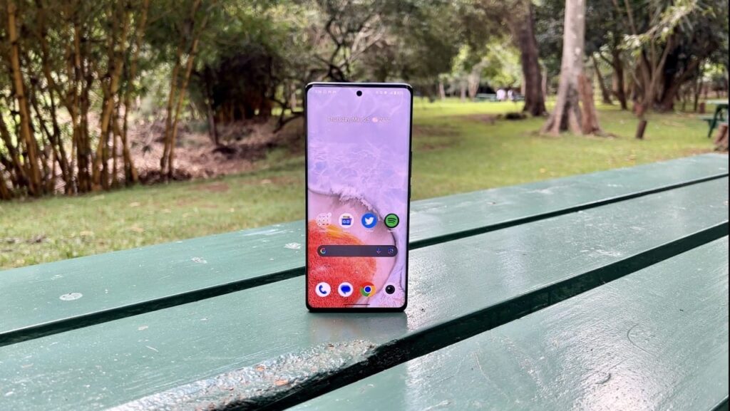
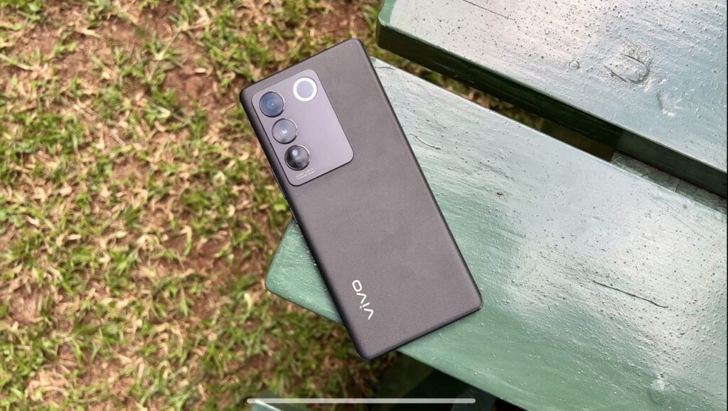
If you read my Reno 8T 5G review, you know how much I liked that device’s curved screen. That’s the same case with the Vivo V27. It feels so well done. And the curve gives the phone this almost unrealistic thinness. It is so thin, and so sleek, and so nice on the hand. If you end up buying it, be removing it from the case (it’s included in the box) once in a while to just admire the craftsmanship that went into designing it.
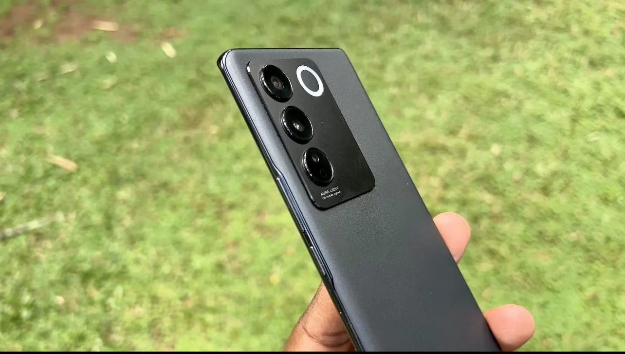
I love the feel at the back. Its smooth, and hides all fingerprint smudges. I like the metallic frame. I like that the top has this flat surface with text “Professional portrait”.
I wish they put the volume keys on the left and the power button on the right. But that they’re all on one side is also okay.
I like that it is so symmetrical in every way from the curves to the bezels to the frames. It is a beautiful device.
The display gets plenty bright. And you can customise it with three modes: Standard (which is default and okay), Pro (which gives you true to life look), and Bright (which makes everything pop). You can also adjust the colour temperature to either be warm or cold depending on what your eyes enjoy.
Remember it is 120Hz and also an AMOLED panel, so everything feels so nice to interact with.
Software:
Everything is clean. And if there’s semblance of bloatware anywhere, it can be easily removed. There is no copying of Apple UI with notifications and control centre clones. It’s just the good old Android quick settings.
The Settings App is so simple and finding things is easy. The default launcher is clean and simple. And you can choose to have Google discover (on by default) on the left.
There are so many nice wallpapers already inbuilt, and you can have them affect the System UI colour, or choose you own colour if you prefer that. You can even change the colour and look of App Icons, without needing third-party icon packs.
Notifications are well done, and you don’t have to struggle to view something you don’t want to open, or to remember certain swipes to dismiss notifications you don’t need anymore.
Vivo made Funtouch so easy, and so fun – as in the name. And I am ready to fight anyone who thinks Android should look any different.
All that goodness is backed by a device that performs so well. Everyting is smooth. App installations are fast. Opening and closing anything is fast. Interacting and switching between activities is fast. I’ve never felt or thought I’m using something that’s not flagship. Not once.
Battery life
My main worry when I got this phone was battery life given its not 5000mAh battery. But I’ve been pleasantly impressed with what I’ve been getting. Vivo doesn’t have that cool graph showing you consumption at different times, but it shows you an estimate of remaining time with the current percentage, and the last time phone was fully charged.
I have had no issues and no worries with the battery, but maybe primarily because I carry two phones.
What I love is that the device supports 66W fast charging and that the charger is included in the box. And that I can top it up quickly whenever its not at the right percentage.
Cameras:
I won’t say much about cameras. Instead I will show you many pictures and videos I took with the phone. And you will be the judge.
I will however say three things:
- The main cameras are good. But don’t zoom when taking a phone just move closer. The zoom is terrible.
- The extra lenses are as usual not worth it.
- This is the contender for the best video camera on an Android phone at this price point, fight me.
Conclusion:
I wish vivo was more proactive in marketing their devices. People cant’ buy devices they see on Google Ads only. People need to see people using these devices, talking about these devices, sharing their experiences.
The Vivo V27 is a good phone, and I’ll keep with me for a while.
Design and Display - 8
Software and Performance - 7
Battery Life - 7
Cameras - 6
Value for Money - 7
7
Vivo V27: Excellent mid-range phone with impressive display, performance, and cameras, but lacks microSD, headphone jack, and IP rating.

