
If you’ve opened your Phone by Google app lately, you may have noticed something feels… different. That’s because Google quietly rolled out a big redesign under its new Material 3 Expressive update and let’s just say, not everyone is loving it.
The new look first landed in June for beta testers, before gradually hitting more users worldwide. And while Google says the revamp is meant to make calling “simpler and easier to navigate,” reactions online show a pretty divided crowd.
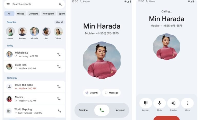
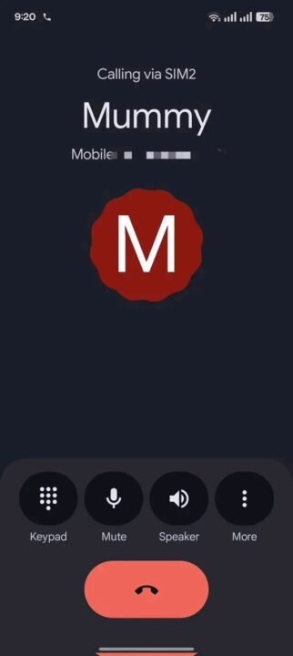
Below are screenshots showing before (left) and after (right) the new update to the Phone by Google app.
What’s New in the Phone by Google App?
Google’s announcement at the time highlighted a couple of changes, including:
- Favorites bar upfront: No more digging into a separate tab just to call your besties.
- Simplified call log: Calls now appear in a flat chronological list, instead of being nested under each contact.
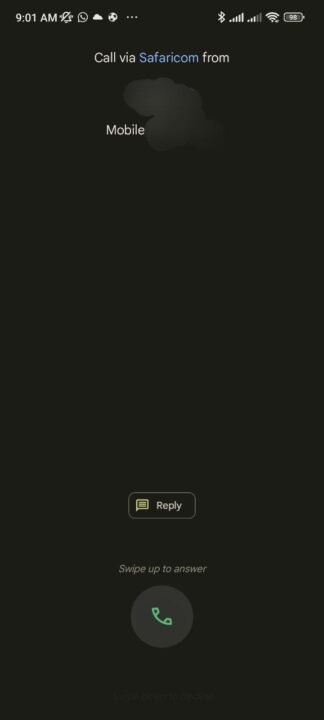
- New incoming call UI: Here’s the big one – instead of the classic tap or swipe up/down to answer or decline, the new design uses a horizontal swipe gesture. The interface is also much larger, with huge contact names and bold profile pictures.
Sounds neat on paper, right? But in reality, this change is where the frustration starts.
Why Are People Upset?
Scrolling through comments online, the biggest complaints are about the call screen size and privacy concerns. The new screen feels oversized and exposes too much information, making it easy for others nearby to immediately see and identify who’s calling since the contact names appear extremely large. Others are struggling with the new swipe gestures, claiming it makes answering calls awkward compared to the old simple tap.
And then there’s the brand confusion. A good number of vocal complainers are Redmi owners, leading to the myth that Xiaomi/Redmi is behind the redesign. Spoiler alert: they’re not.
This isn’t a Redmi-specific update. It’s a Google-wide update that applies to all Android devices using the Phone by Google app. So whether you’re on a Redmi, a Pixel, a OnePlus, or anything else – if you use Google’s dialer, you’re in the same boat. If you’re using your phone brand’s native dialer (like Samsung’s own Phone app) or a third-party app, you won’t see these changes.
Can You Get the Old Design Back?
Yes, you can. If you really can’t stand the new look, you can roll back to the previous design by uninstalling updates for the Phone app.
Here’s how:
- Method 1: Long-press the Phone app icon → select App info → tap Uninstall updates.
- Method 2: Go to Settings > Apps > Manage Apps > Phone > Uninstall updates.
Don’t forget: After doing this, you’ll want to disable auto-updates for the app in the Play Store, or the new UI will sneak back onto your phone the next time updates roll out.
So, What Do You Think?
Personally, I get why Google wanted to freshen things up with Material 3 Expressive. The new design does look modern and fits better with Android’s evolving style. But at the same time, I totally understand the frustration. The giant contact names and swipe gestures aren’t for everyone, especially if you prefer the subtlety and simplicity of the old layout.
What about you? Do you prefer the old Phone app UI or the new Material 3 expressive design? Vote below.