If you are a constant reader of this site you’ve, over the last couple of days, seen me fight around with colours and fonts and ad positions. Yes, it is a tedious job getting everything to not only look good, but also be user friendly.
I’ve tested out soooooo many colours I am sure some of you are confused.
Many websites feel too cluttered. And I really don’t want that. When I started tech-ish.com, I blogged from 2014 to early last year with no ads. I was just doing it, and learning the ropes. I can’t say I know much right now, as every day there’s something new to learn.
But you all understand the site needs ads to survive. And that’s why there’s even this page over here talking about advertising on the site. So whitelist me on your ad-blockers please.
Anyway, I think I found some good choice of colours and fonts. I think anyone can now enjoy using the site. The titles and subtitles have good font weight and sizes for better distinctions, as does the rest of the body post. You won’t have a problem, I want to believe, making out what’s written whether you’re in good or bad lighting and you can easily navigate and find more content.
Make tech-ish your favourite news source
Star tech-ish.com on Google. We move up your daily feed.
I’ve also finally settled on four main colours. Yes four! And I have made them accentuate each other in different ways. It is a stray from the normal only blue and only green I had previously tried. I hope these new four main colours work well together and don’t confuse anyone anymore.
I am trying to have a site I would personally enjoy interacting with.
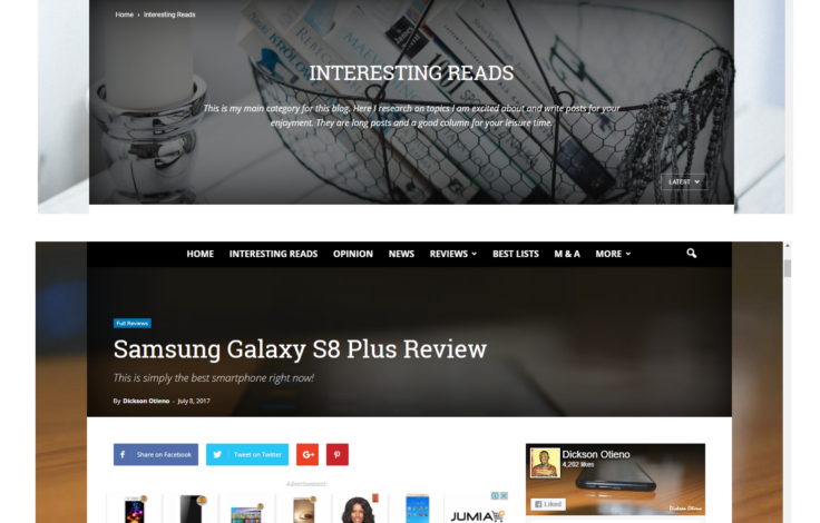
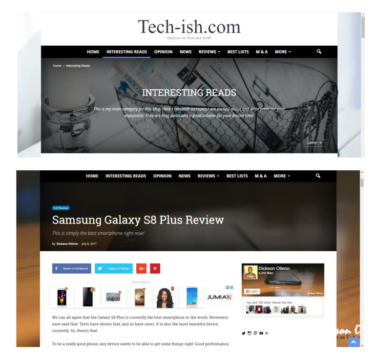
Here’s the desktop:
If you have any improvement suggestions, or things that annoy you continue sharing with me. It is your feedback that has kept this site going anyway.
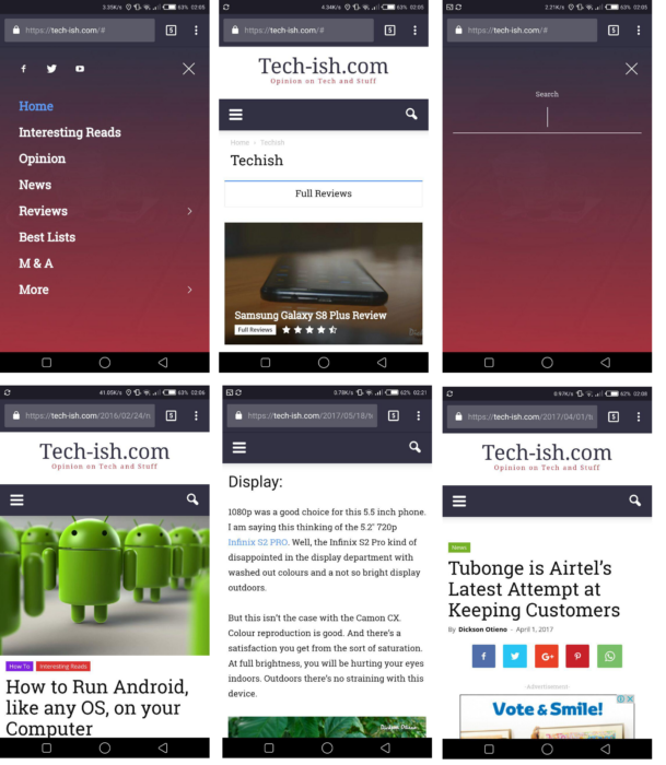
Here’s the mobile:
Ads, as always will remain distinct with the labels -Advertisement-. I may at times change positioning to try and get better revenues, but that will be ever so rarely.
Feel free to tell me what you think of this. I hope I got things right now. And I hope you love your interaction with the site.


Join the discussion