This would be a very different review, if I wrote it in the first week I used the Hot S3x. Back then, I would have complained a lot about many things, from the notch, to bugs with the software. But there was a system update, and since then, I have had no serious issues with this phone. I kind of came to actually like it.
Okay, if you don’t want to read this whole post. Here’s the TL;DR: There’s no difference in performance between this phone, the Infinix Hot S3, and the Infinix Hot 6 Pro. If you want a notch, and a different design to flaunt, get this device. There.
If you want to know full specs, and what you get in the box, here’s my unboxing post which also has a video:
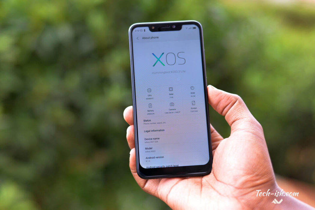
Ever since Apple’s iPhone X, companies started having the notch as a feature. Oh we also have a notch, oh our notch is 10% bigger, 20% smaller, premium design etc. And even though this may sound crazy, and stupid, it isn’t. People love the notch.
Try this: get a friend of yours who’s not upgraded their device in a while. Walk with them to a store and show them phones priced between Ksh. 14,000 and Ksh. 20,000. In that price range, currently, many devices are similarly spec’d. But I bet you many will be looking at the Infinix Hot S3x first. Why? The Notch.
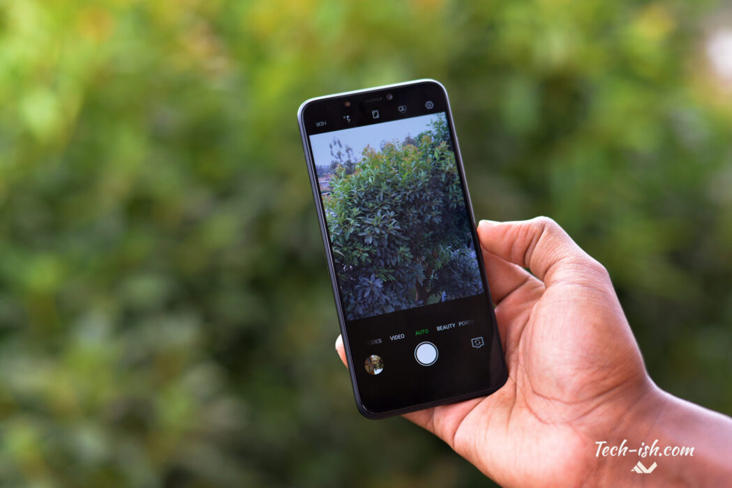
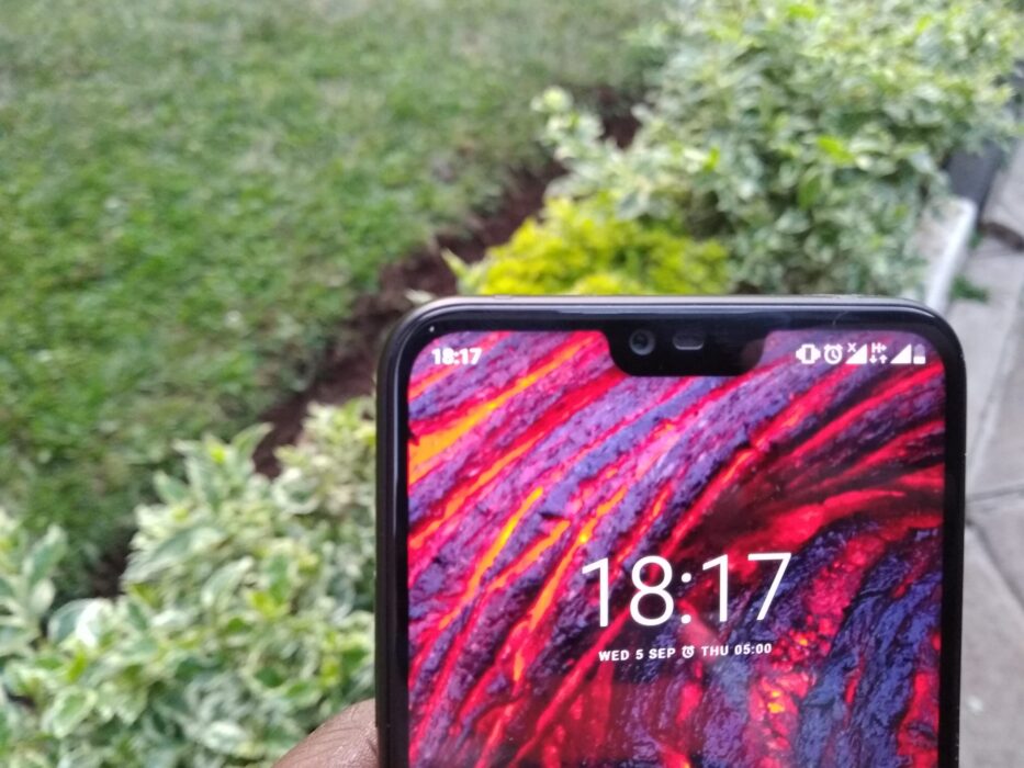
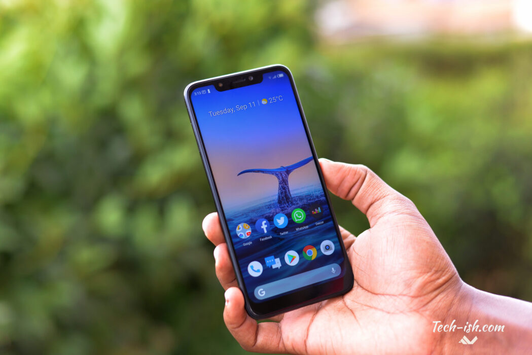
To be honest, the notch is doing nothing that special on this phone – well apart from looking good, and increasing very slightly, the screen-to-body ratio. On the iPhone that cut out is for sensors. A lot of sensors: infrared camera, proximity, light, flood illuminator, dot projector, main 7MP camera plus the speaker, and microphone. On the Infinix Hot S3x, there’s the flash, light sensor, speaker and the main 16MP camera in the notch area. I believe the size of this cut out could be reduced and still accommodate all that.
![]()
I have no problem with having a notch. Yes, I have changed my mind somewhat. I have liked how people stare at the phone whenever they see that cut out. It somewhat makes the phone seem more expensive than it actually is. BUT, I don’t like the way the notch cuts out stuff! I miss watching full screen videos on YouTube.
Okay, as you can see, the clock has been moved to the left. Now on the right you’re only getting the Battery, Network and WiFi icons. There’s no space for any other icons. If you want to see other icons you have to pull down Notifications, and then pull down shortcuts. So if I have my bluetooth headphones connected, I need to pull down to see the connection. If I want to see battery percentage, I need to pull down the shortcuts. If I want to see internet speed through the inbuilt meter…. It is exhausting. But there’s no way around as the notch has eaten up that space. However, I’ve kinda gotten used to doing that.
Also, on the left, there’s only space for the clock and two notification icons. So very many times you’ll see three dots next to the notification icons indicating there’s many more notifications to check out.
![]()
Before the system update, there was a lot of bugs. My review then would probably have been titled Problems with the Infinix Hot S3x. I had issues unlocking the device, I had issues with the display not being responsive, plus the notch cut out stuff in WhatsApp stories, it cut out out stuff in Instagram. Using maps was a problem. But the update solved these. And I can finally see WhatsApp and Instagram stories without the notch cutting out parts of the content.
The only bug I have currently is sometimes when I try to unlock phone it says ‘Inadvertently Mode’ and screen stays black even though nothing is covering the light sensor. I hope an update fixes this soonest.
If you’ve used an Infinix phones, you’re getting with this device pretty much the same experience with XOS. There’s not much of a difference except for what I’ve already mentioned up there with the notch.
On paper, a 720p res display doesn’t sound exciting at all. But like the display on the Infinix Hot 6 Pro, and the Hot S3, this is a good panel. I like it. It can get really bright. I don’t like that it doesn’t get that dim especially in dim conditions. I can’t use it in bed to read anything as the dimmest it gets is still quite bright for my eyes. But for consuming visual media like videos, and games, you’ll enjoy the colour saturation. It is an IPS panel with good viewing angles. Blacks aren’t that dark though. Maybe it is because I’ve been using AMOLED displays with true black.
In terms of general performance, it is okay. There’s the usual slight lag when I have many apps open and I’m switching from one to the other. But all in all, it performs quite well for my slight demands on a phone.
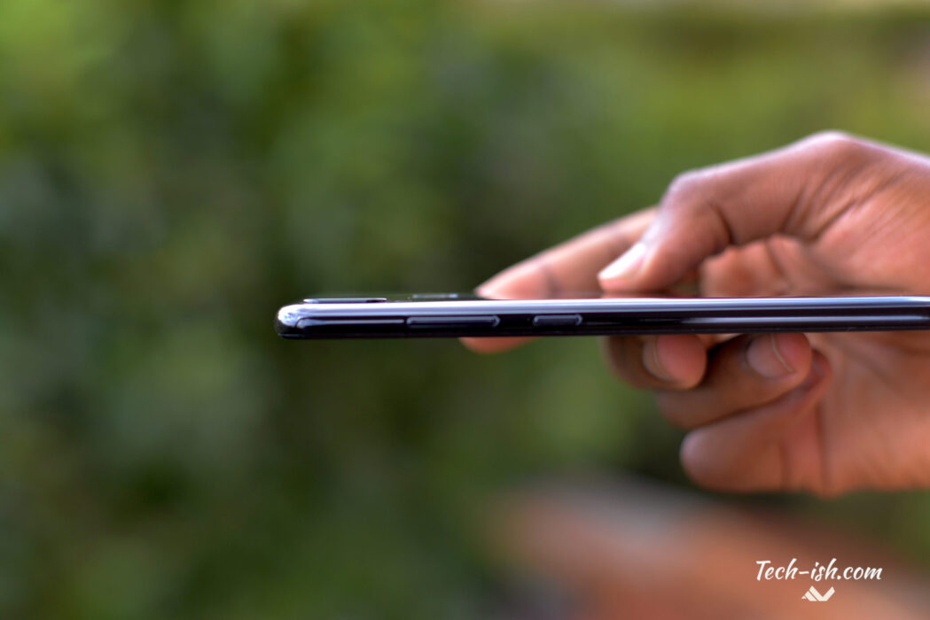
I use my phones mostly for YouTube, Twitter, Facebook, Chrome, Facebook, WhatsApp, and Apple Music. And in all these sectors, apart from WhatsApp, I’ve had no issues whatsoever. My experience has been smooth no matter what content I load on Chrome even though after having about 12 tabs open, I feel the app ‘get heavy’, and there’s stutters with the pages.
I’ve noticed that very few apps stay in memory. Maybe about 3 or 4, and for a short time, only when phone screen is on. Say I have a page loaded on Chrome and I switch to Instagram or to YouTube, when I come back to Chrome, that page will need to reload. It is even worse when I lock/switch off phone screen. Whenever I get back to the phone, and open an app I was using, it’ll need to relaunch. And this causes a big problem with an app like WhatsApp or Telegram.
It is quite a serious problem which I hope Infinix will address through an update. XOS is aggressively killing background processes. Whether it is doing so to save battery or to make the performance feel smooth, I don’t like it. Because it means whenever I want to see new messages I may have received on WhatsApp, I will need to launch the app everytime I unlock my phone. For someone who doesn’t switch off data, and who wants to always stay connected, it is not a good experience. I hope a software update soonest addresses this.
Now on battery life, I’ve been getting between 4hrs 30mins and 5hrs 45mins screen-on-time for the past week. I mean a full charge will last me the whole day on normal use. Which despite being quite good, is not what I expected with the 4000mAh in-built battery. Maybe the aggressiveness of killing background processes is counter-intuitive as it causes a lot of drain when the apps need to restart. I don’t know. I wanted to be able to push about 7hrs screen on time.
Remember this is a variant of both the Hot 6 Pro and the Hot S3. It has the same cameras as the Hot 6 Pro at the back: a 13MP normal sensor, plus a 2MP depth sensor. You can take those portrait mode shots with the blurred backgrounds, and you get to have the power to adjust the background blur after taking the shot.
Whilst the Hot S3 had 20MP front camera, this one has a 16MP shooter. It takes quite good pics even in very low light as there’s that bright LED flash. You’ll however need to hold still as the front camera is very sensitive to shakes, and you can end up with bad out of focus pics.
Infinix say both cameras are AI powered, but they still don’t come with AI capabilities we’ve seen with other AI-powered cameras like on Huawei and OPPO devices where you point the camera at an object and it knows what it is and optimises the camera settings for the conditions.
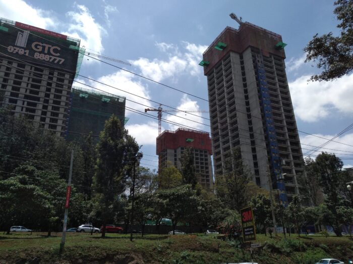
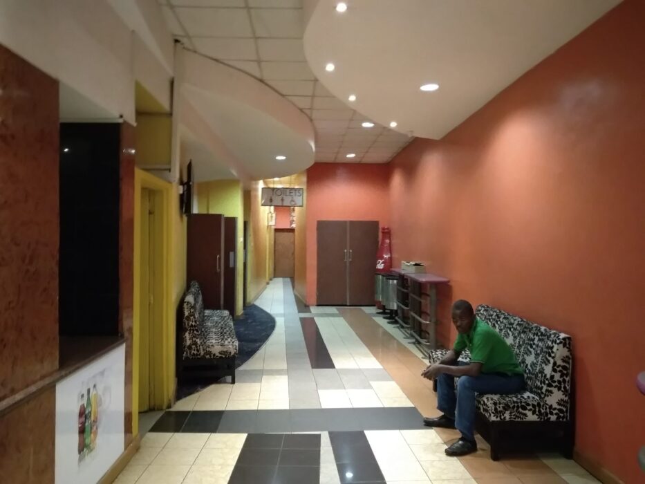
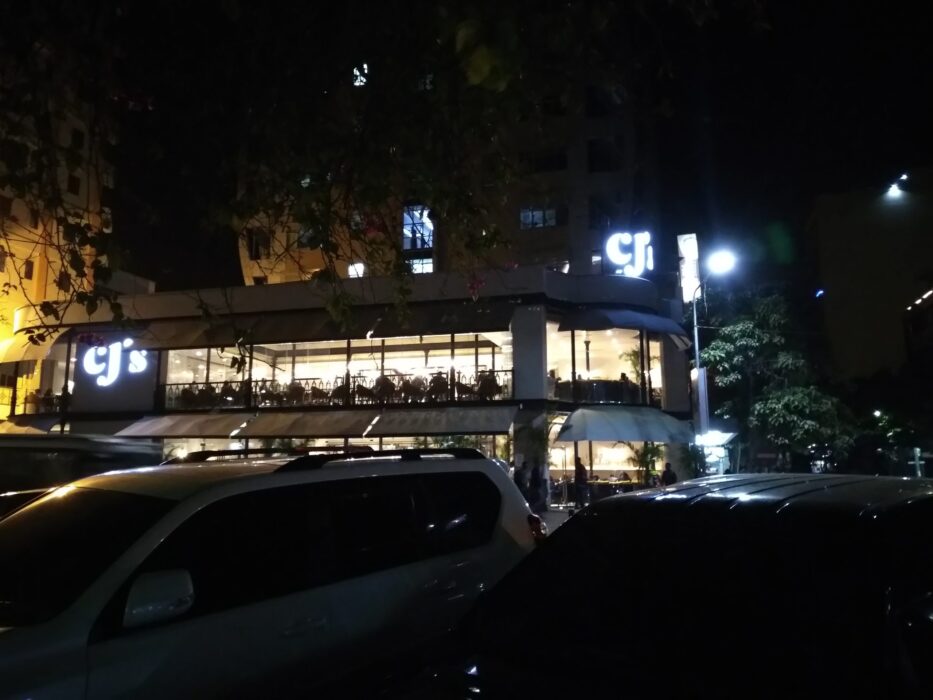
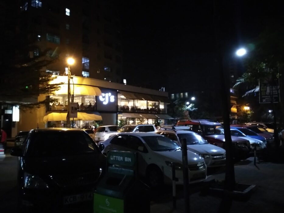
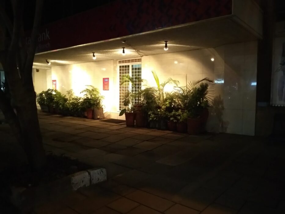
Low light shots aren’t the best with the back camera. In good lighting however, pictures look really good.
Shot using Infinix Hot S3X:
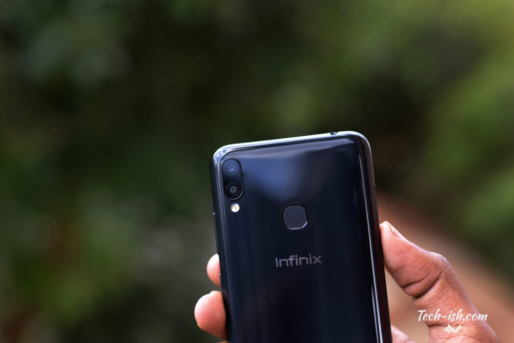
If you’re getting this phone, know you’re getting an incredibly designed budget device. Okay in all seriousness, you could use the same design of this phone on a phone with say a Snapdragon 660, keep the cameras and charge people 28k and above. It is that good of a design.
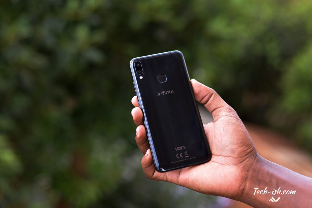
I love that the plastic finish at the back isn’t as scratchy as the one used on the Infinix Note 5. Also, it is shiny and gives a good impression of being glass. I asked 7 people who had not touched it what they think the back was made of. 2 said metal. 3 said glass.
What constantly amazes me a month later, is just how light this phone is despite packing that 4000mAh battery. That fact only – that a phone would pack a huge battery, but still feel quite light – would win me over with any phone.
What I don’t like:
- Adverts: I don’t know why XOS launcher thinks sending notifications on the latest icons and stuff is something I am interested in.
- The Chin: the bottom bezel is quite thicc. If the whole point is offering a larger screen-to-body ratio, I believe Infinix can reduce it.
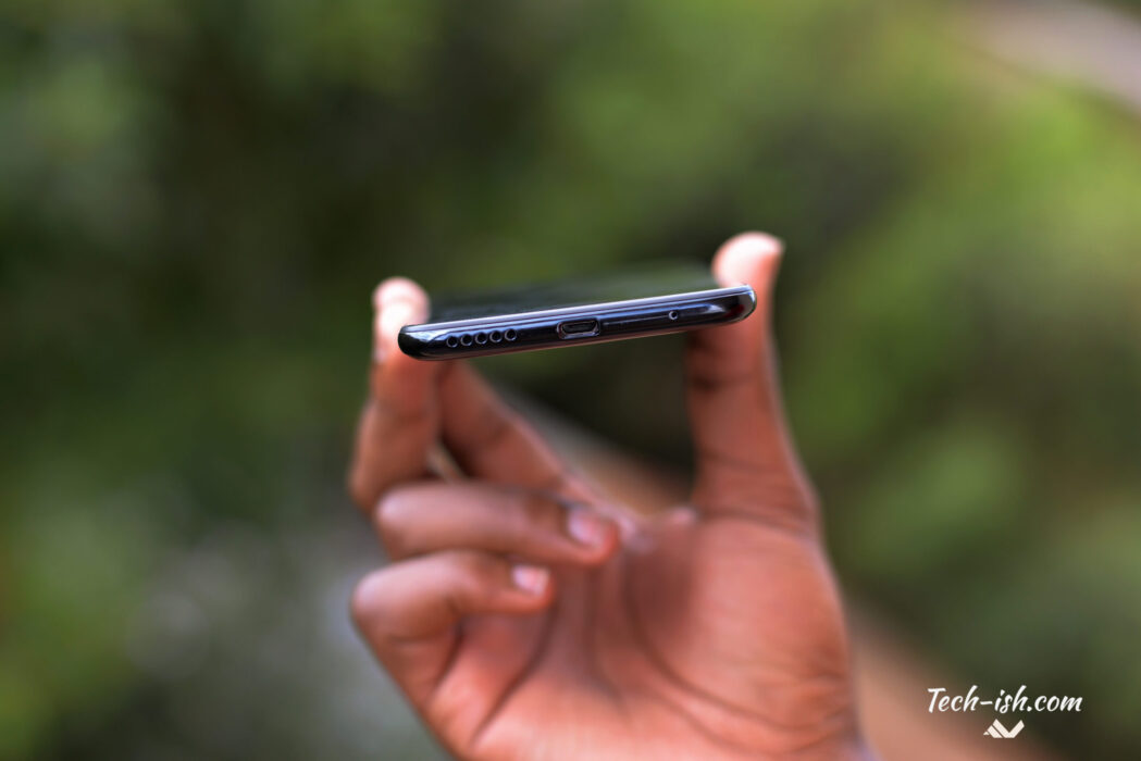
I feel like the Infinix Hot S3X plays a significant role for the direction of the company designs going forward. Meaning, we should expect more notches. That said, I hope they make serious changes to XOS. There’s a lot of wasted space that could be used better to accommodate more information despite having a notch.
Also, that aggressive killing of background processes needs to stop. The Snapdragon 430 is capable of better battery life while powering a 720p panel with a 4000mAh battery.
This is a good phone I’d recommend for anyone who loves owning something not just because of the specs, but also because of how it looks.


