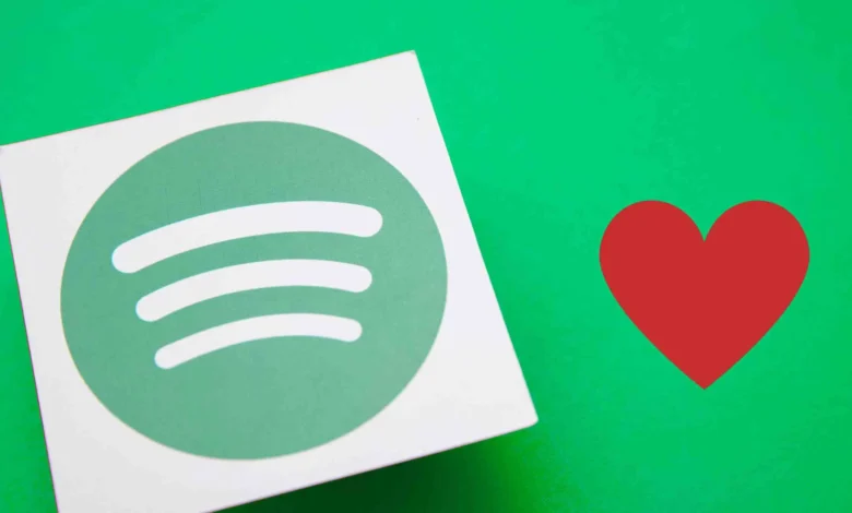
In the digital age, how we interact with music is ever-evolving. Spotify, the music streaming giant, has long led this evolution, curating an intimate, personalized experience for its vast user base. But it appears that with the recent design changes, Spotify may have skipped a beat. The heart button, once an icon of our love for particular songs, has been replaced by a plus (+) button—a shift that many have found counter-intuitive and frankly, quite disappointing.
The essence of the heart button was its ability to simplify a complex emotion. A heart meant “I love this song”. It was more than just a bookmark, it was an interaction. Every heart clicked added a new element of personalization to our Spotify experience, influencing our daily mixes, Discover Weekly, and Release Radar playlists. With the plus button, this nuanced interaction has been reduced to a mere transaction – ‘adding’ a song to the library.
Moreover, it’s become increasingly confusing to navigate the Spotify interface. While using CarPlay and Android Auto, the heart button is still present, creating a disorienting inconsistency. Users may wonder: Why does the interface change across platforms? Should I be ‘loving’ songs on one and ‘adding’ them on another? Spotify should be striving for simplicity and continuity in its user interface, not sowing seeds of confusion.
The plus button’s ambiguity has further complicated the process of curating playlists. What if a user simply wants to add a song to a playlist without committing it to their library? The heart button provided a clear distinction between loving a song and adding it to your library. There are numerous songs that users might want to include in their library for completeness but don’t necessarily wish to encounter regularly.
One has to ask, why abandon an easily recognizable symbol that has permeated the digital landscape? The heart icon is a widely accepted expression of fondness or appreciation. Competitors like Apple Music have incorporated it successfully, and it’s a staple on social media platforms like Twitter, TikTok, and Instagram. Changing an intuitive and familiar icon to something less expressive seems like a step in the wrong direction.
Make tech-ish your favourite news source
Star tech-ish.com on Google. We move up your daily feed.
Lastly, and perhaps most importantly, the heart button turned our interaction with music into a loveable experience, not just a process of adding to playlists. It’s about fostering emotional engagement and making music personal, about falling in love with a song and telling Spotify, “more like this, please”. With the removal of the heart button, Spotify risks making a platform that is less about the individual’s passion for music and more about cold, impersonal functionality.
Spotify has always been a platform that puts its listeners at the heart of the experience. The heart button was a symbol of this approach—an acknowledgement that music is more than a transaction; it is a bond, a passion, a love. So, Spotify, it’s time to bring back the heart. Not just for the sake of continuity or clarity, but to restore the personal and emotional connection that your platform has always promised to its users. The heart button was more than a feature, it was a testament to our love for music. And it is dearly missed.


Join the discussion